Medtronic Learning Platform
About
Medtronic is a global leader in medical technology, services, and solutions. Along with medical devices, the organization delivers a learning platform for healthcare professionals to facilitate further education and training in the use of Medtronic products. We were responsible for UX/UI design in cooperation with the Medical Education Learning & Innovation Team (MEDLI).
Services provided
Design Research, Wireframing & Prototyping, User Testing, UX/UI Design

Challenge
With the coming of the pandemic, MEDLI stakeholders didn't expect a marked increase in portal traffic and users seeking further training. Before the pandemic, the portal was not in high demand by healthcare professionals. What we found was that users had difficulties in enrolling in the courses that prevented user engagement. On the whole, there were numerous technical limitations to address, and it was, therefore, necessary to strike a balance between user empathy and technical restrictions.

Project Approach
Key improvements for the encouragement of user enrollment include:
- Implementation of a self-enrollment process on course pages.
- Repleted the course outline with course benefits and values.
- Redesigned email communications for user notification of course enrolment and learning progress.
User Research
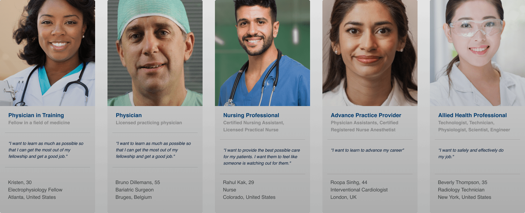
Starting in Aug 2021, MEDLI (EMEA team) and Medtronic Academy (US team) cooperate to deliver the Global Medtronic Educational portal. One of the goals of design research was to consolidate personas from two existing Medtronic educational portals. This resulted in the identification of five primary learner personas. These insights were helpful in creating a tailored experience for each user.
User Testing
We conducted two rounds of usability tests with the HCPs (Healthcare Professionals) in several countries of EMEA. Before that, user feedback was gathered solely from online surveys and not from direct 1-1 interviews with the users.
The usability test consisted of the following:
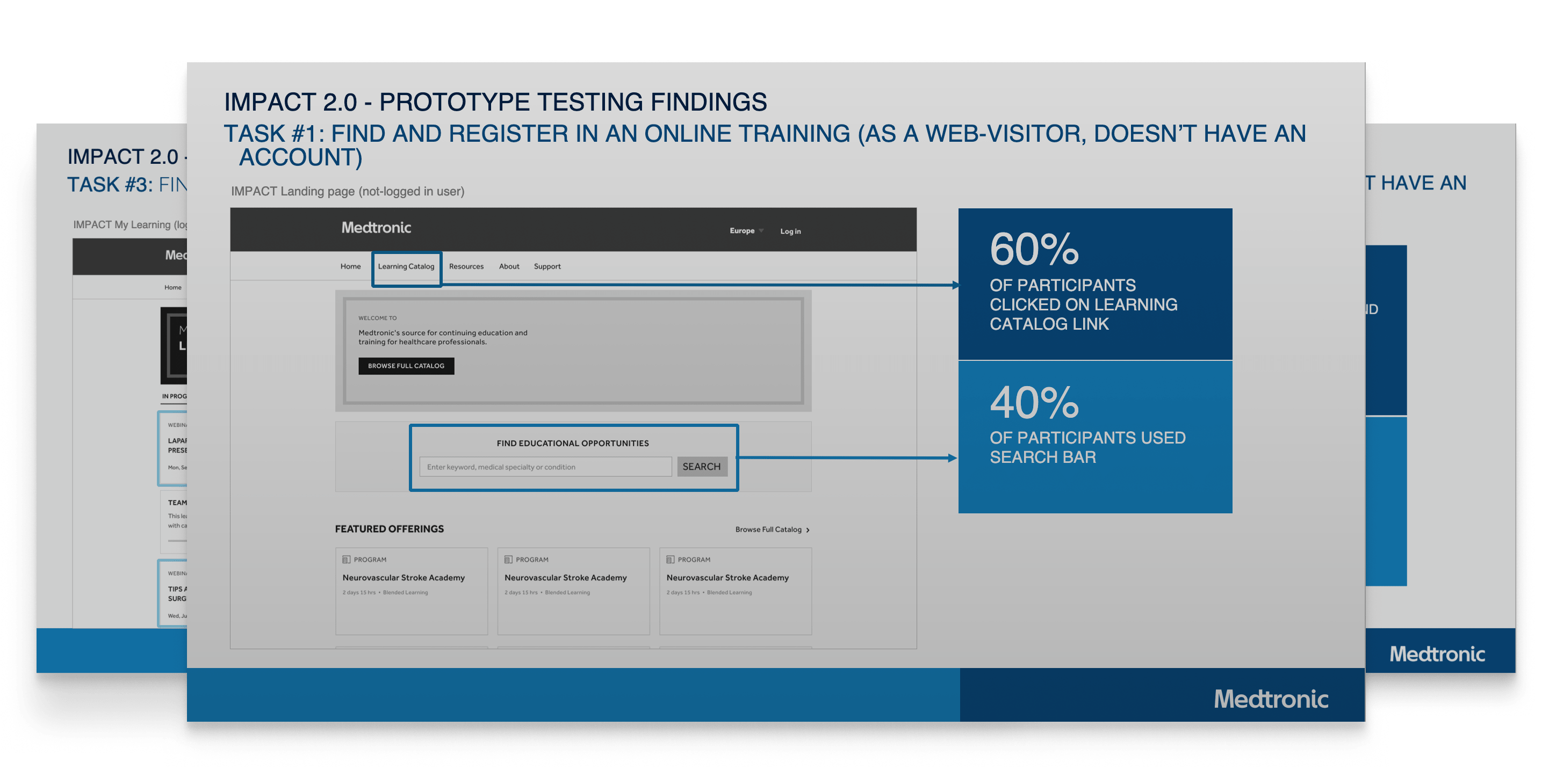
- Prototype validation: During the validation process, We tested two versions of the prototype to understand mental models of healthcare professionals.
- Closed card sorting: To determine whether users clearly understand the terminology on the learning platform. It was found that most participants had difficulty identifying the meaning of the terms for which we revised the terminology according to user language.
Wireframing
As a team, we worked in an Agile environment. This challenged us to provide rapid wireframes and prototypes for further discussion with the developers and stakeholders. The final decision was greatly facilitated by visual representations and flows.
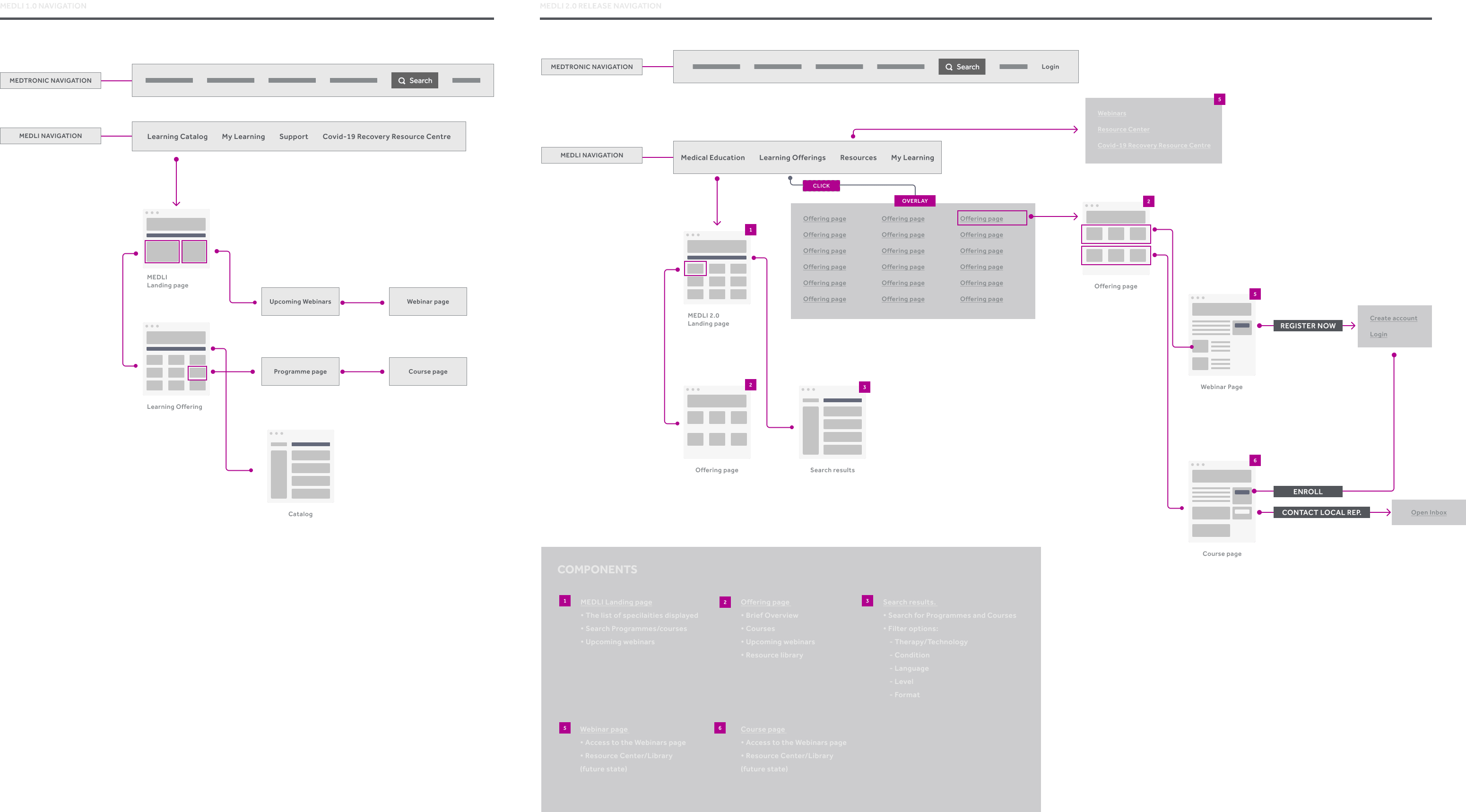
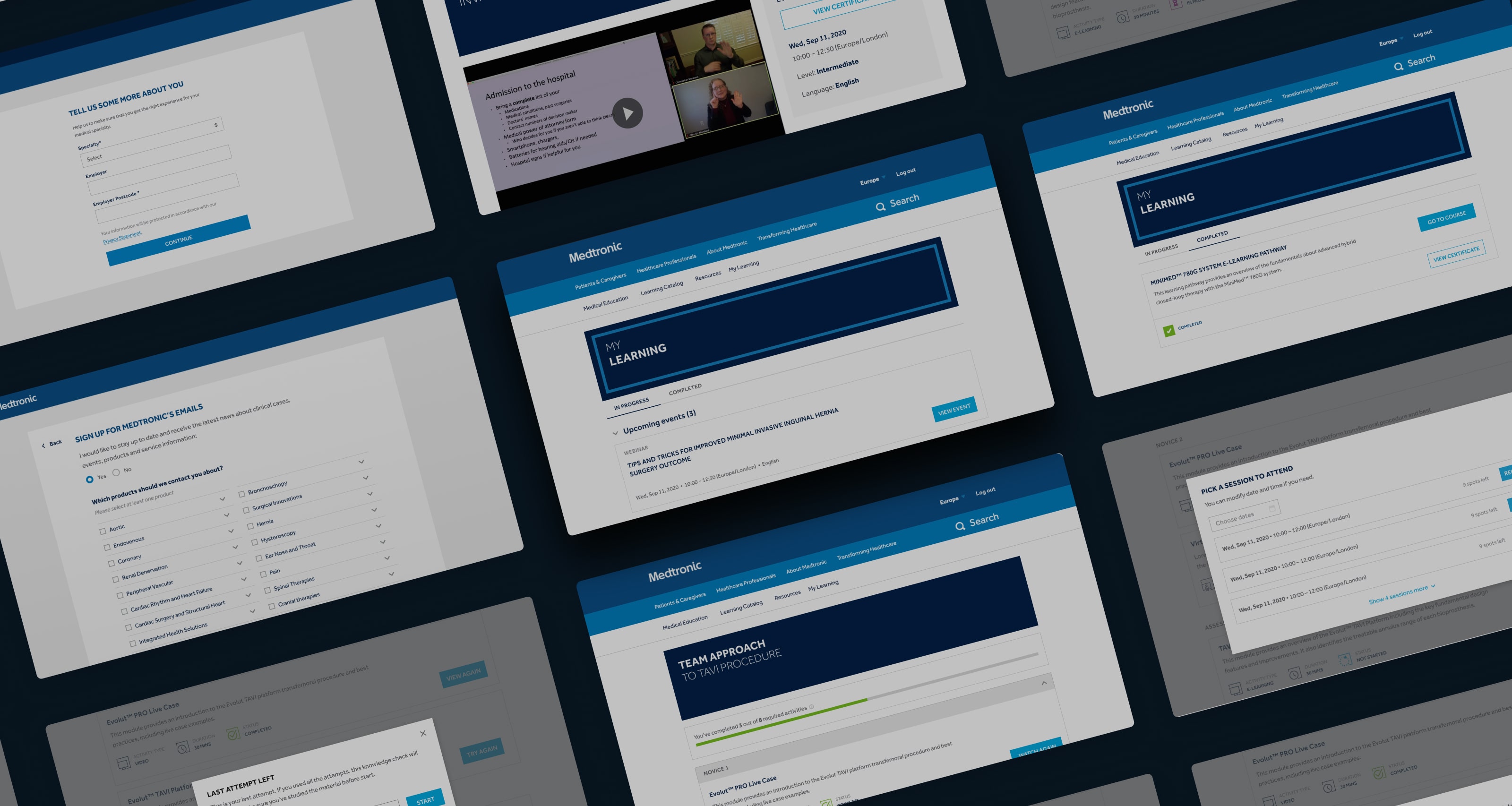
Solutions
We gained the data and insights through user research, which allowed redesigning the experience in an easier and more accessible way. We considered the entire journey from platform awareness to enrollment and course learning. After migrating to the new UI, the number of learners and completed learning activities were increased, thereby it demonstrated the impact of the platform redesign.
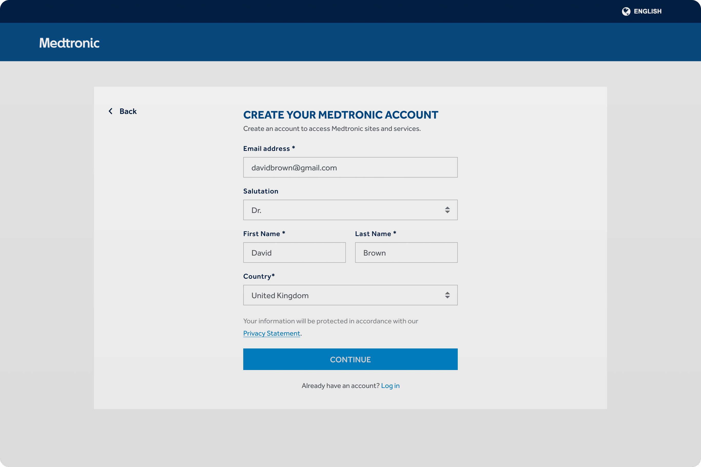
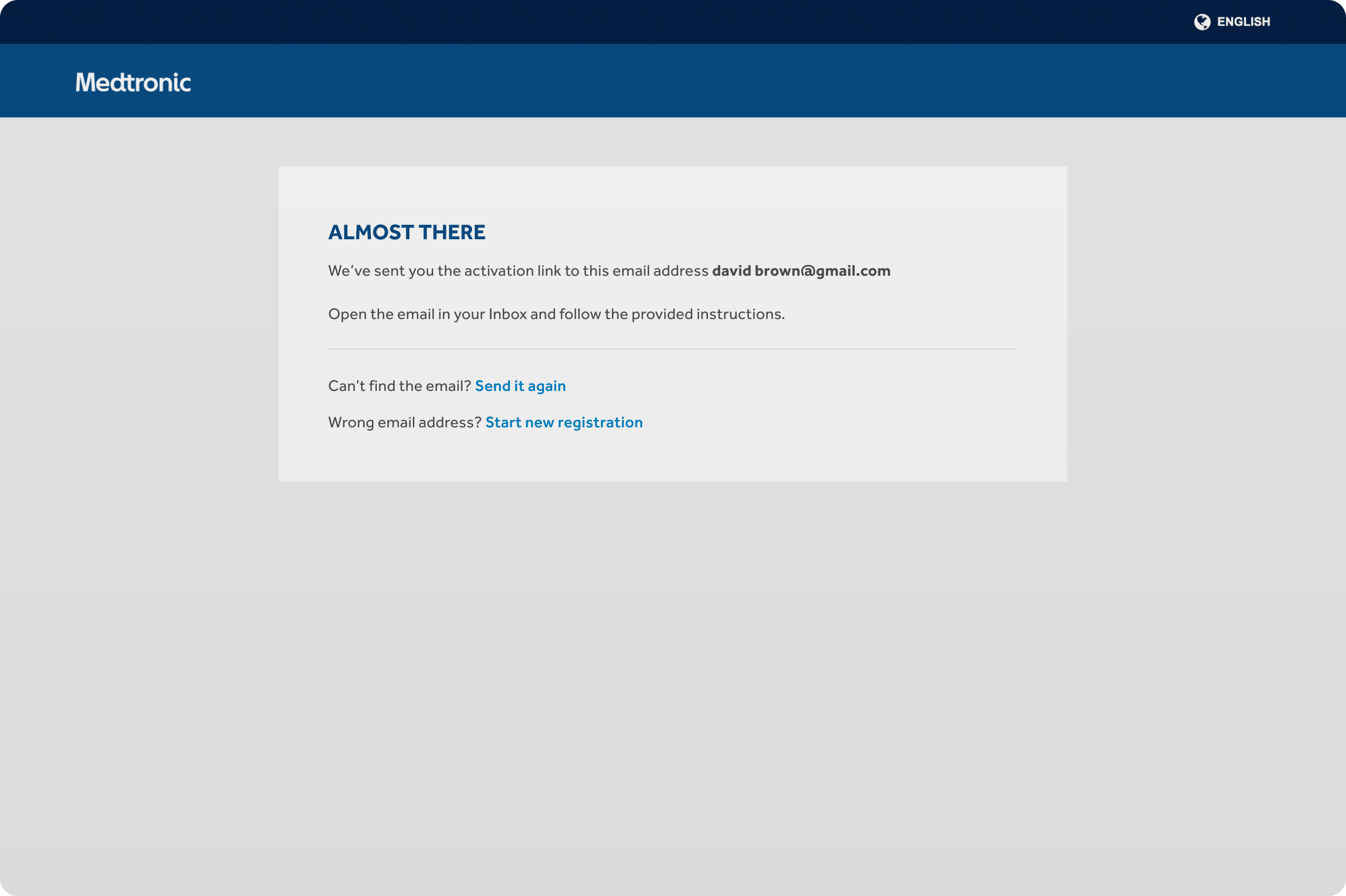
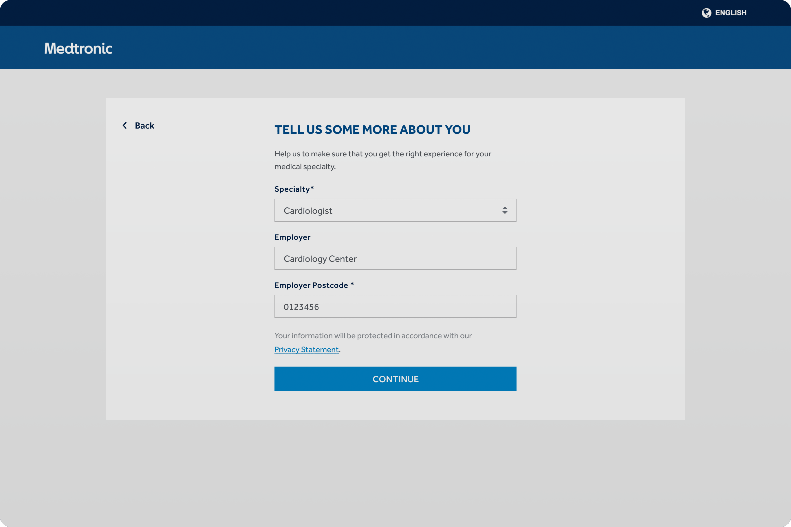
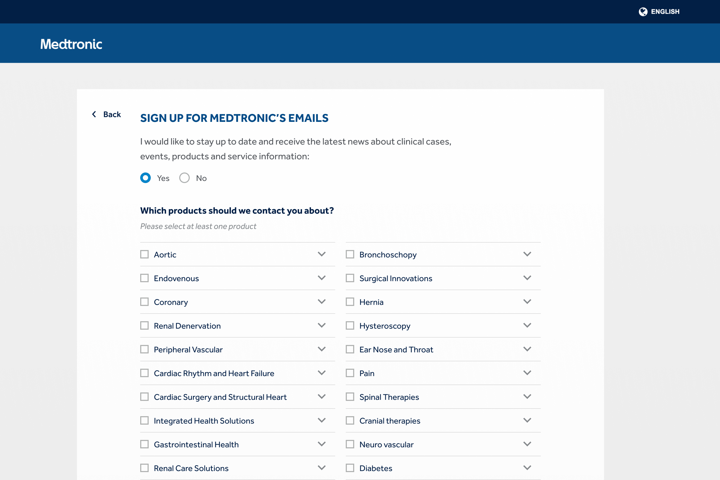
1. Self-Registration
As per business requirements, the registration process requires users to provide an extensive amount of personal information before accessing their accounts. Therefore, we produced a multi-step registration process to reduce potential information overload.
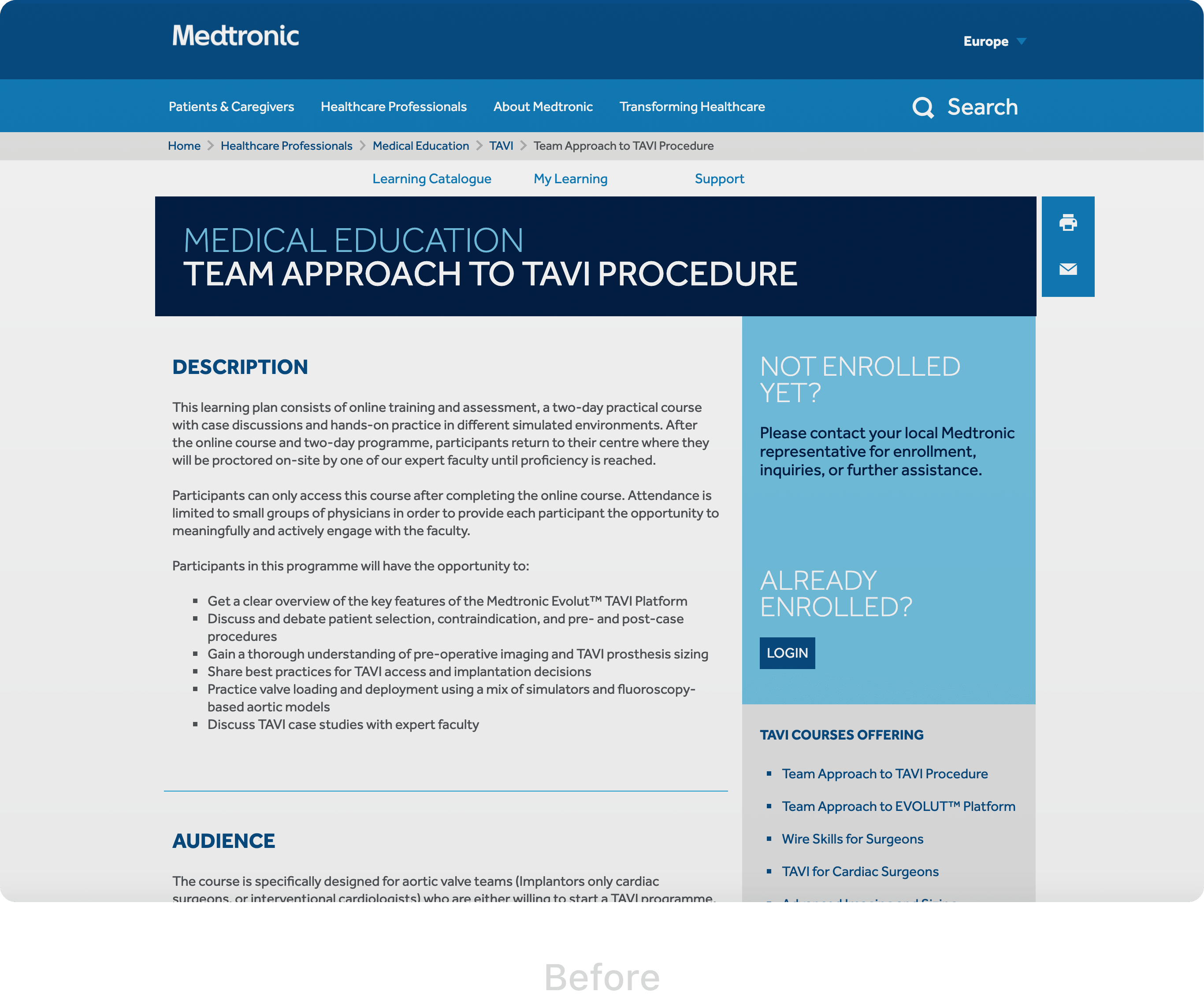
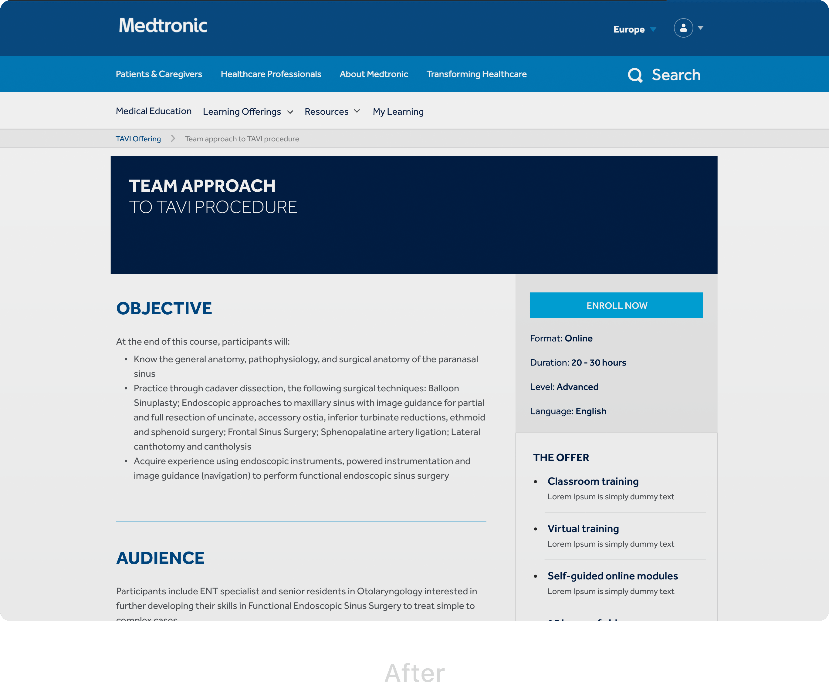
2. Course overview
Based on the user testing results, we determined that displaying course format, level, language, and duration were essential for users before enrolment. Therefore, we added these details to the course page.
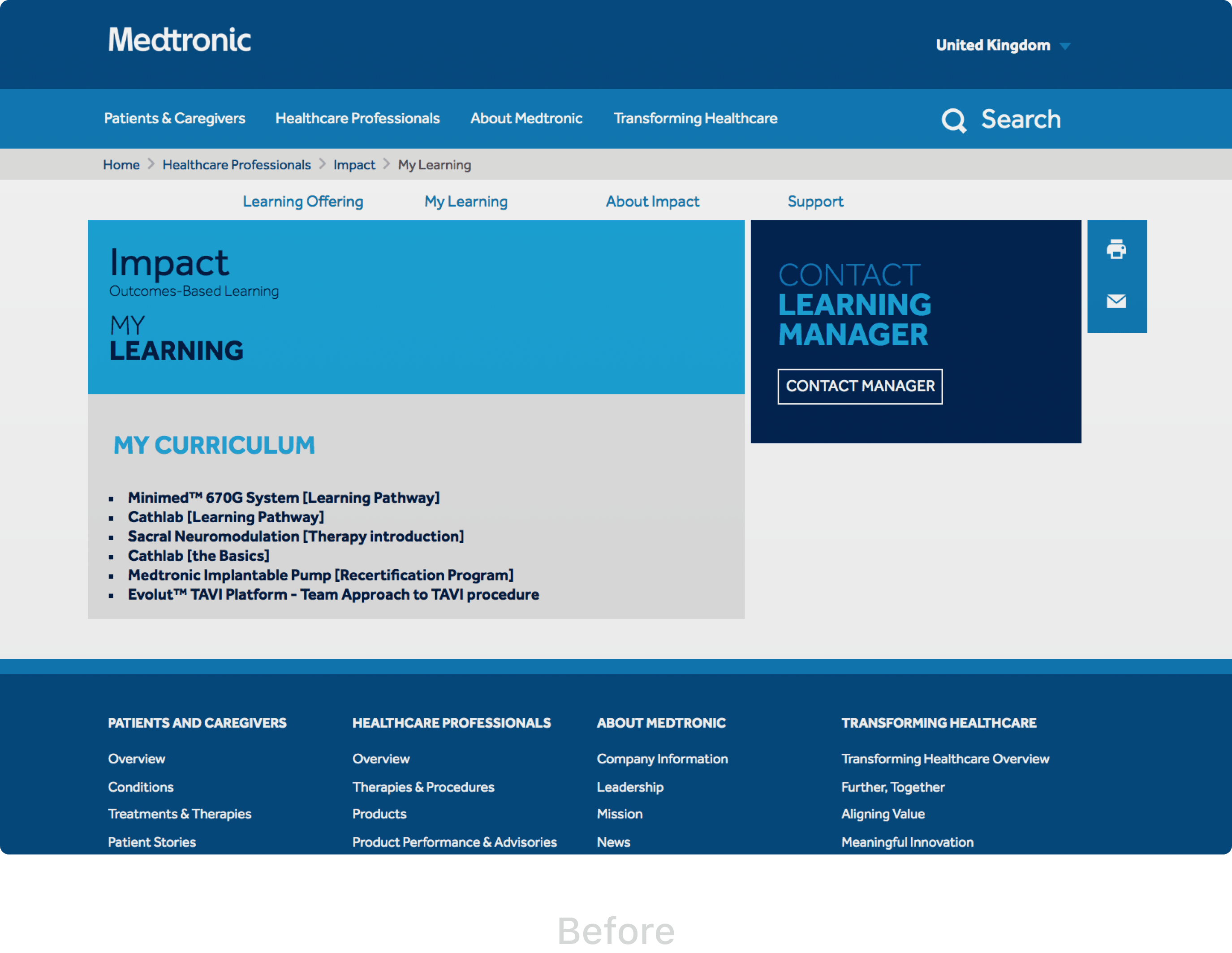
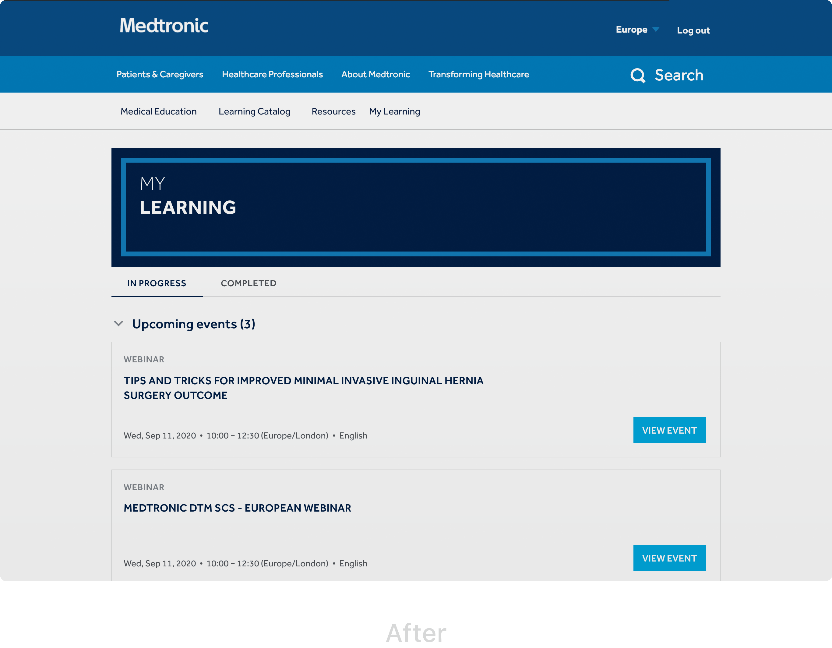
3. My learning
The old version of this page only had a list of links that were not informative nor sufficiently valuable for end-users. In sum, we made the following changes to this page:
- Navigation: The user can easily find active and completed courses from the tab menu that sorts courses and events based on their progress and completion.
- Visibility: Each course has a progress bar for the user to distinguish courses based on their rate of completion.
- Hierarchy: The "Accordion" allows a user to navigate across courses and online events. Furthermore, since 2019 and the consequent global pandemic, MEDLI launched virtual events. This was the reason for including them as part of "My learning" to remind the user of upcoming events.
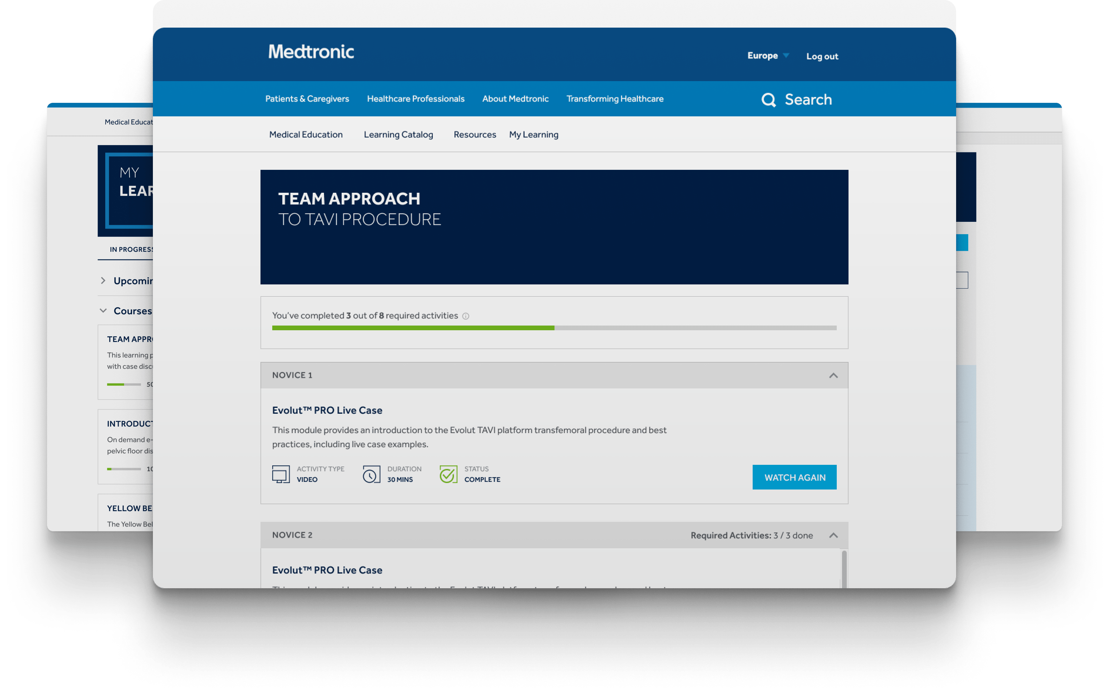
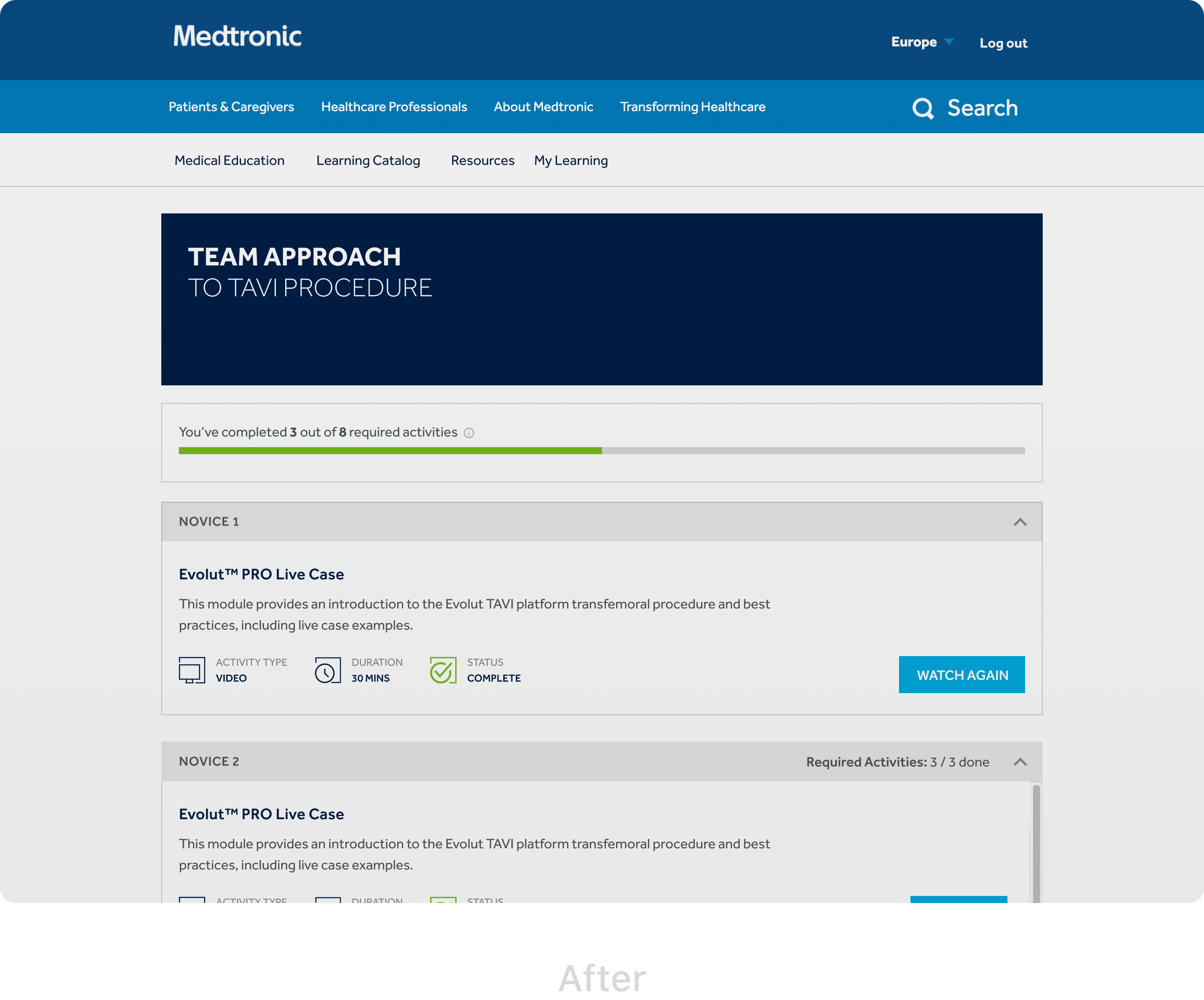
4. Curriculum
This page presents an overview of all the course modules and activities. As gathered from the analytical data, this is the most visited page. Therefore, we changed the page structure removing all unnecessary content. The total course progress was presented more prominently, and the modules became clean and legible.
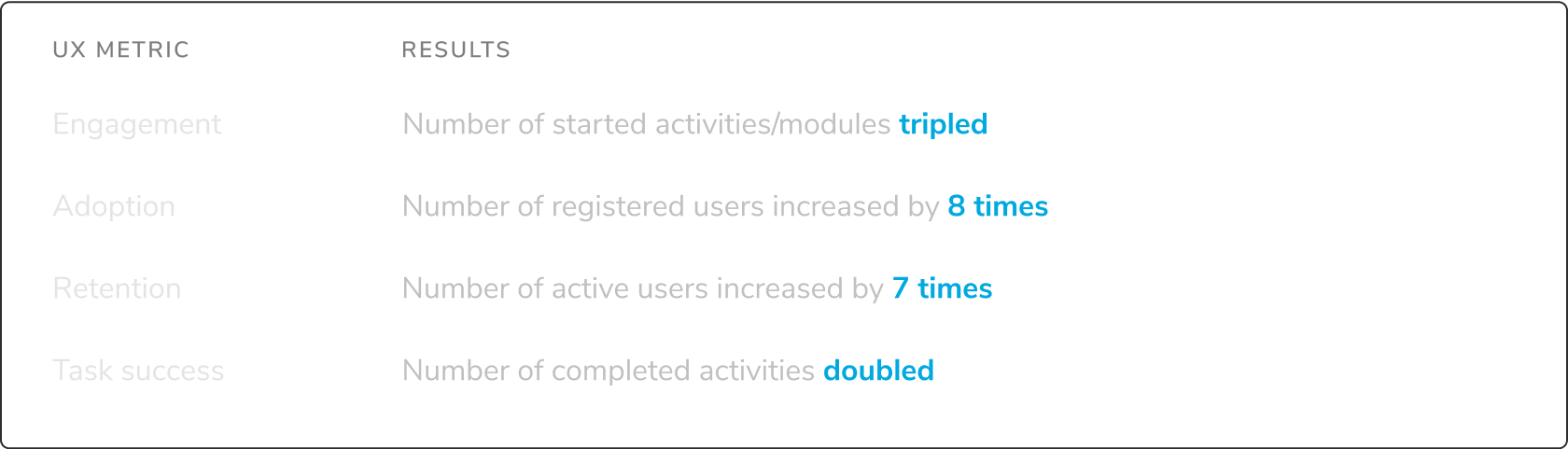
Report Results
The success of the redesign and development was informed by the user-centric metrics..
Client's Feedback
"Anastasia is an excellent partner in all things UX (wireframes, user research, etc). She is knowledgeable, reliable, proactive and above all trustworthy. I got excellent results working with Anastasia and would recommend her services wholeheartedly."
Eduardo Chavez, Snr. Digital Transformation Manager | Product Owner