Neuron Mobility System
Intro
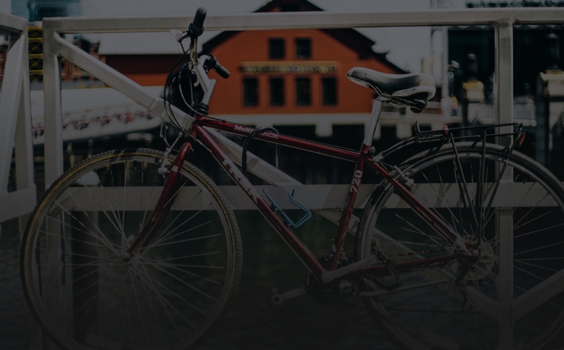
Neuron is an existing brand in Singapore that offers different travel services for tourists and citizens. One of this services is the bike-sharing system. We offered the design concept that highlights the brand's vision and engages new users.
Services provided
Design Research, Wireframing & Prototyping, UX/UI Design, UI Animation
Challenge
Neuron mobile app has complex gamification and sharing functions. We were responsible for making the modern and delightful experience for the users. At the same time, we had the task to translate this complexity to the intuitive and easy-to-use design.
Project Approach
During the project, we asked ourselves the question: how to make the interface for sharing systems convenient and useful yet fun and playful at the same time? Since the app is oriented towards the young people who are opened to new technologies and an active life, we paid a lot of attention to individual design elements which in combination will create a style that engages the users and gives them new opportunities for activity and communication.
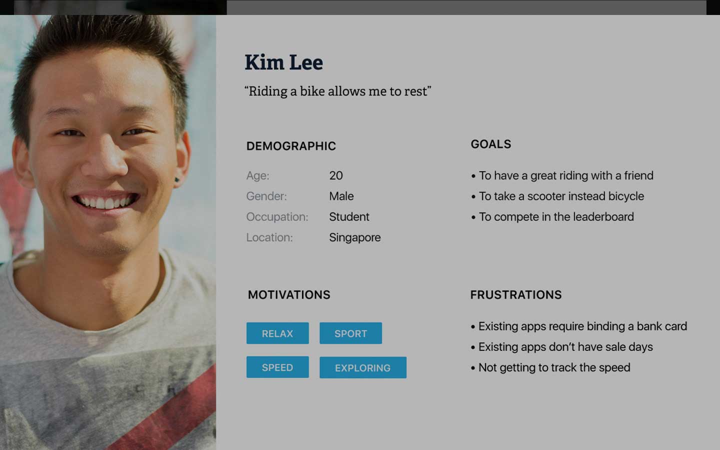
Personas
One of the significant techniques we used in design research was creating the personas. To make decisions and prioritize according to the product’s vision and user’s needs personas play an important role. The personas were created based on the assumptions and competitor’s analysis to inform our design decisions. They include 2 types of users which can be categorized into travelers and Singapore citizens.
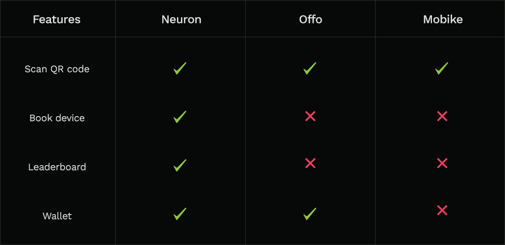
Competitor Audit
The audit provides the comparison based on analyzing the competitor's functionality and user experience. It helped us identify the Neuron app's advantages.
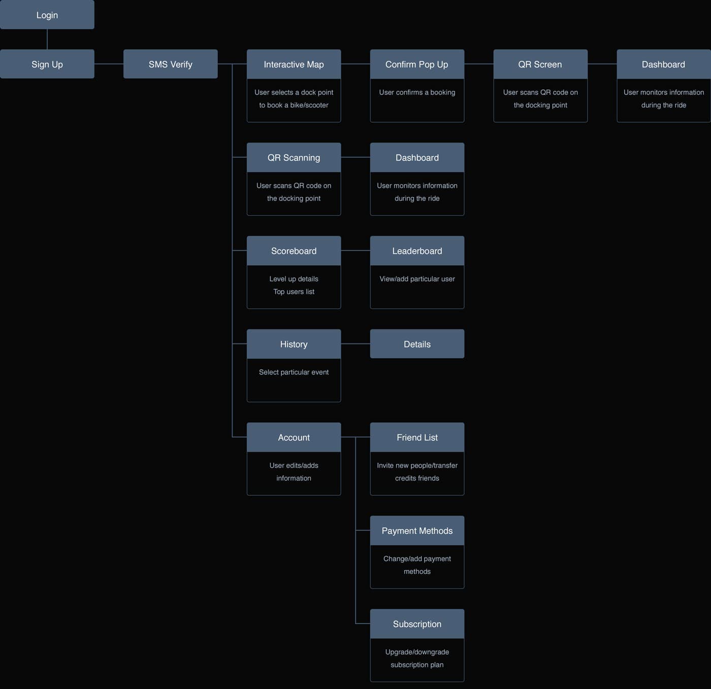
User Flow
One of the key stages of the design process is the information architecture. Therefore our next step was to create the user flow which defined the user journey in the app.
Wireframing
Starting from drawing our first sketches with pencil and paper, we created the wireframes and then translated them to the high-fidelity designs. During the wireframing stage, we have experimented with different design solutions to select the ones that most effectively would help the user to accomplish their tasks.
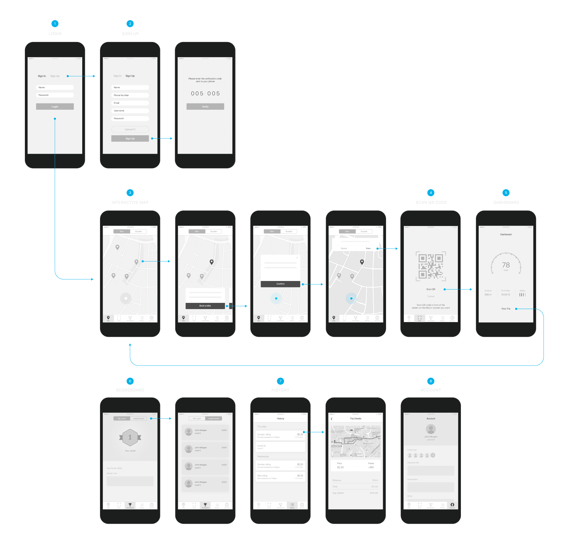
Solutions
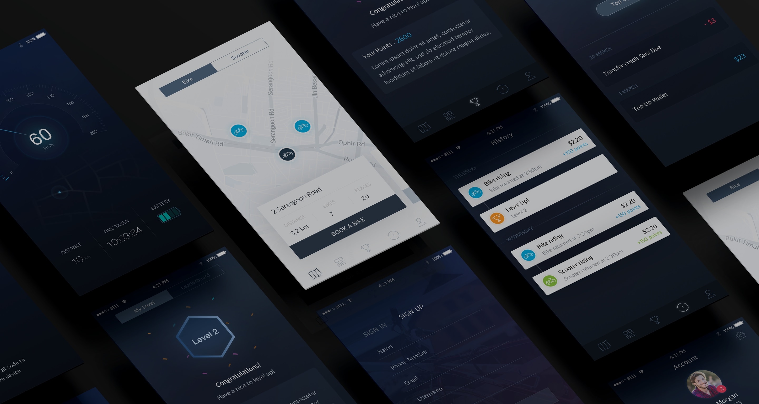
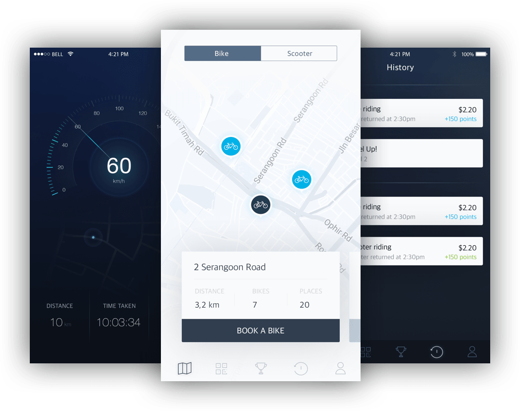
- The interactive map is the first upon opening the app. This allows the user to quickly book a device.
- The "book a bike" feature is implemented so that the user can book a bike before their journey.
- The interactive map provides the user with information about each docking point and available devices for booking. It allows the user to easily book a bike in any part of the city.
- The dashboard UI is created so that the user can easily track the data about their journey and feel confident in any ride.
Visual Design
Neuron already has the "Cornflower Blue" as the primary color so to diversify the palette we picked the additional colors. Since the main audience is young people who are open to new technologies and social communication, we chose colors associated with the game and activity.
Primary
Secondary